Customizing the simple composer
| Other than the options set in the composer-page, the theming- and color-settings of ZBOS Control are also applied. |
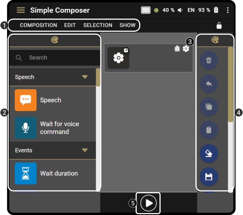
There are 4 major sections in this page, specifically:
-
Toolbar (Cloud Control only)
-
Blocks (with programmed actions)
-
Timeline (containing the blocks)
-
Tools (for managing compositions)
-
Execution-buttons (for starting or stopping compositions)
For a full list of all options available for a specific type of block in the composer, see the chapter Block list.
Changing the layout of the composer-page
The layout of the composer can be changed in different ways, specifically:
-
Changing the ZBOS Control style-setting
-
Changing the layout + color-scheme of the blocks
-
Changing the layout of the tools-page
Changing the Style setting
See the chapter Style on how to change the current styling of ZBOS Control.
Changing the layout and colors of the blocks
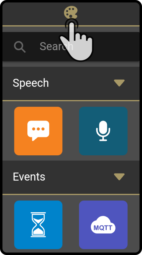
Tap the icon at the top of the block toolbar to open the style settings.
In the following popup, the options for the blocks can be set (and previewed).
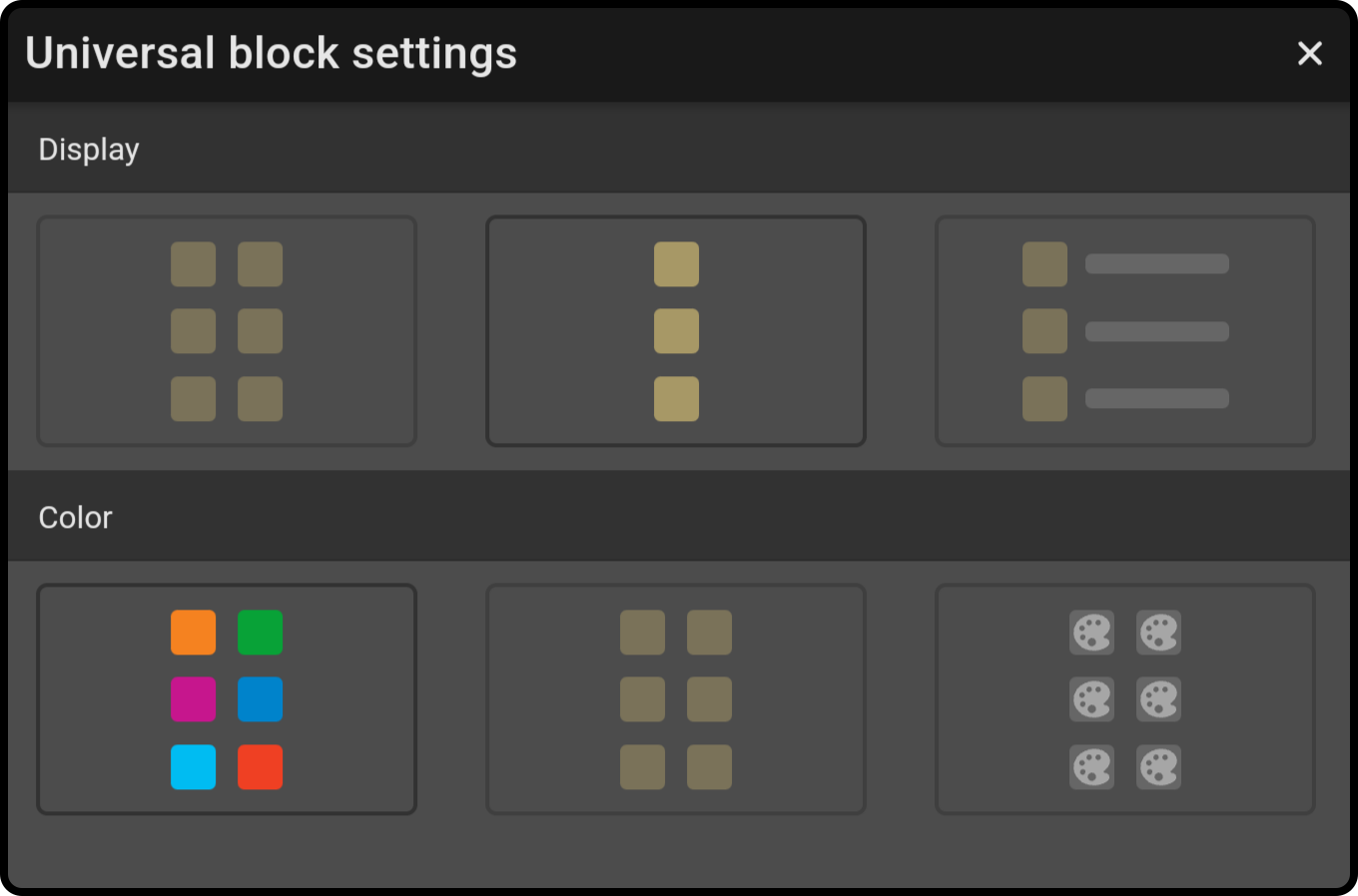
Available Display options
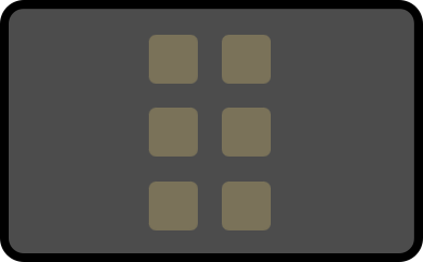
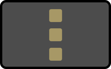
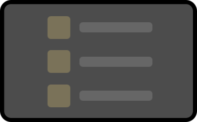
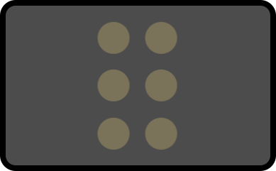
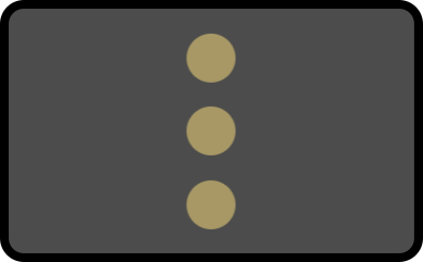
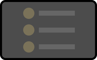
The blocks can be shown in various formats, such as 2 icons side-by-side or a single-column list with an explanation. The list below shows the available options:
|
Select this option to display the blocks in 2 columns, side by side. |
|
Select this option to list the blocks in a single column. |
|
Select this option to list the blocks in a single column with a text-explanation next to them. |
Available Color-options
Other than the display, the colors of the blocks can also be edited. The list below shows the available options:
|
Select this option to use the default colors for the blocks. |
|
Select this option to use the colors set by the current style for all blocks. |
|
Select this option to customize the colors for every block separately. |
Customizing the color for a block
| The Custom color option must be selected in the style settings for the blocks. |
Tap and hold a block to open a modal asking if the block should be styled in the theme-color or the default-color.
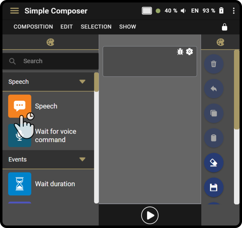
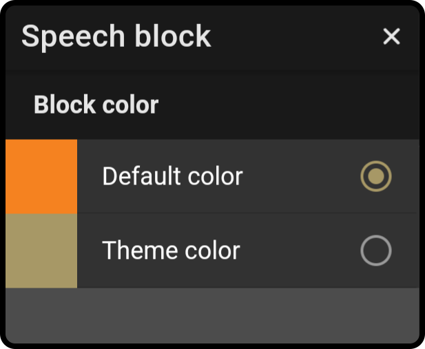
Tap outside the modal or on the icon ![]() to close the modal.
to close the modal.
| The new setting will be applied immediately. |
Changing the layout of the tools
So far, only the blocks have been altered. The layout for the tools can also be changed.
Tap the icon in the tools toolbar to open the style settings.
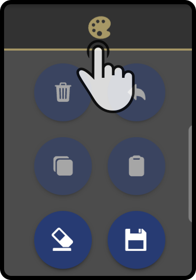
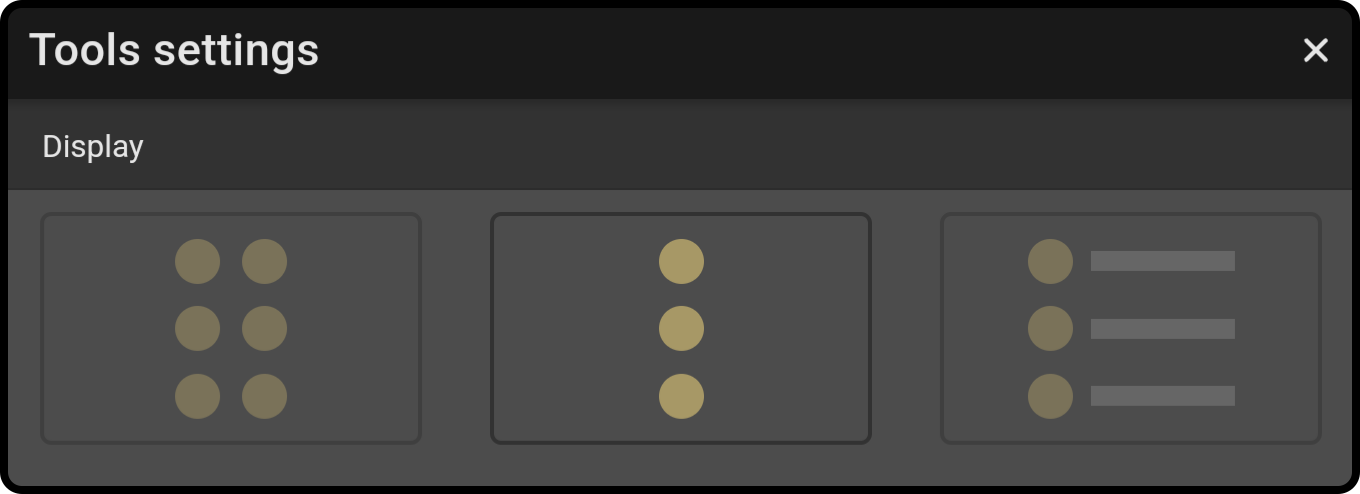
Tap an option to change the layout of the tools in the toolbar.
List of display-options
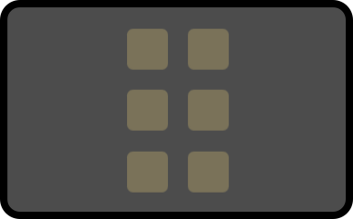
The tools can be shown in various formats, such as 2 icons side-by-side or a single-column list with an explanation. The list below shows the available options:
|
Select this option to display the tools in 2 columns, side by side. |
|
Select this option to list the tools in a single column. |
|
Select this option to list the tools in a single column with a text-explanation next to them. |
