Kiosk Tutorial
To further illustrate the use of the Kiosk editor in ZBOS Control, this chapter will provide the basic steps to create a demo-kiosk.
|
Procedure
To create the kiosk, I (personally) would recommend using the following steps:
-
Create or update the necessary compositions and upload them to the device
-
Download and install the necessary apps
-
Upload the media-files to be used as links
-
Create the basic layout of the kiosk in the editor
-
Add the logos and styling to the kiosk
| Steps 1-3 will not be explained in this chapter, see the corresponding chapters in the manual for more information on the related topics. |
Creating the layout of the kiosk
As stated earlier, make sure all the necessary compositions or media-files that need to be linked are available on the device and that ZBOS Control can connect to the device.
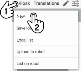
Creating a new kiosk
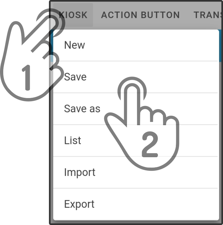
Tap the button New in the Kiosk-menu to create a new, blank dataset.
Once a new dataset has been created, a default language needs to be specified for the kiosk.
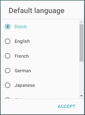
| The terms used for the display will be used for non-translated languages as well. |
Edit the name of the kiosk
Before continuing with editing the content of the kiosk, it is highly recommended to save the kiosk dataset locally. First, enter a name for the kiosk-dataset.
Tap the  icon next to the name of the dataset to edit the name.
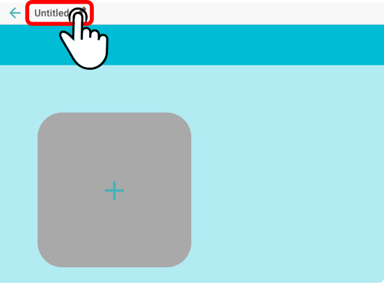
Enter a new and unique name for the dataset (e.g. Tutorial).
| The name used in this chapter for the tutorial-dataset is Tutorial. |
Save the dataset locally
Tap the button Save locally to store the dataset in ZBOS Control.
A message will be shown when the dataset has been stored correctly.
Edit the content of the kiosk
The content can be edited at any time. However, do keep in mind to save regularly when editing the dataset.
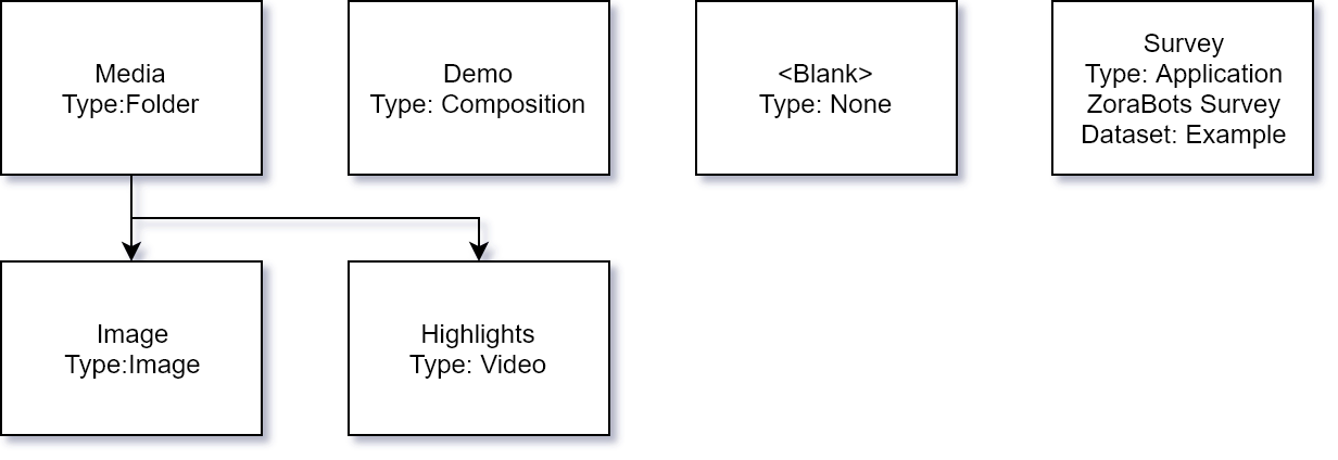
Creating the Media-folder
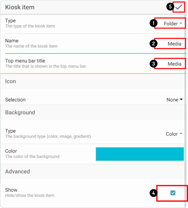
Tap the  icon to add a new item to the kiosk. Enter the following settings to create the Media-folder.
-
Select the Folder type from the available types
-
Enter the display-name shown in the main folder for the item
-
Enter the title for the menu-bar
-
Check if the item will be shown in the kiosk
-
Tap the
 icon to apply the changes.
| The option Show in the advanced settings is enabled by default. |
Opening the media-folder
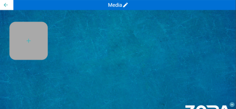
Double-tap the folder-icon in the editor to show the content of the items in the folder.
|
Adding the image icon
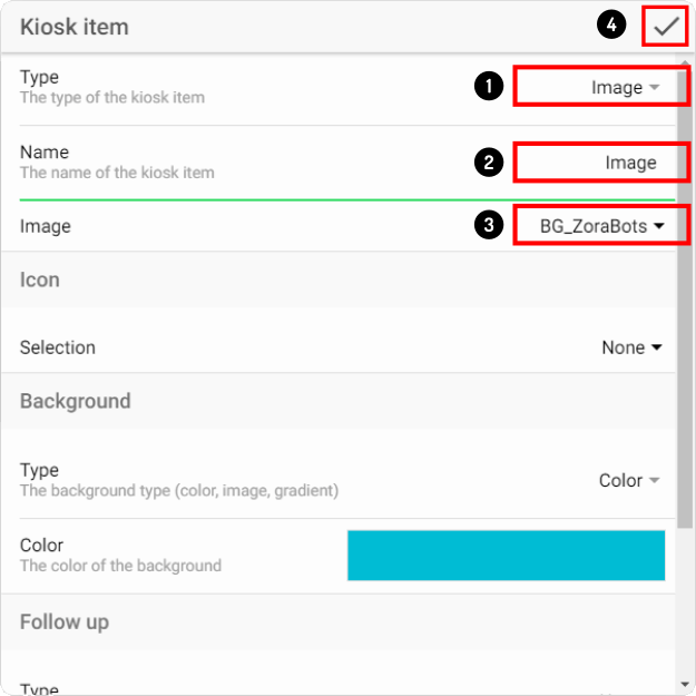
Tap the icon to add a new item to the kiosk. Enter the following settings to create the Image-icon.
-
Set the type of action for the item to Image
-
Enter the display-name of the icon
-
Select the image to be displayed from the list of images on the device
-
Tap the
icon to apply the changes.
Adding the video icon
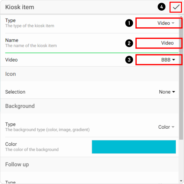
Tap the icon to add a new item to the kiosk. Enter the following settings to link the Video to the kiosk.
-
Set the type of action for the item to Video
-
Enter the display-name of the item
-
Select the video to be displayed from the list of videos stored on the device
-
Tap the
to apply the changes.
Creating the Demo-composition
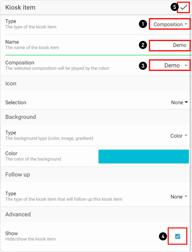
Tap the icon to add a new item to the kiosk. Enter the following settings to create the Demo-composition.
-
Set the type of action for the item to Composition
-
Enter the display-name for the item
-
Select the Demo-composition from the list of compositions stored on the device.
-
Check if the icon will be shown in the kiosk
-
Tap the
icon to apply the changes.
Creating a blank entry
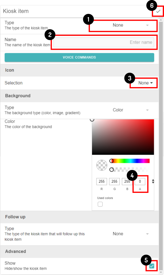
The item-type None has been designed specifically for this purpose.
| Other than the item-type, the background-color also needs to be set to be completely transparent (or no opacity). |
Tap the icon to add a new item to the kiosk. Enter the following settings for the blank entry:
-
Set the type of action for the item to None
-
Leave the name blank
-
Make sure no icon has been selected
-
Set the opacity to 0
-
Check to see if the option show has been selected
-
Tap the
icon to apply the changes.
| Edit the Android-settings so the tapping-noises are not heard. Otherwise, some end-users might be confused when tapping the blank space and hearing something is selected, while nothing is happening. |
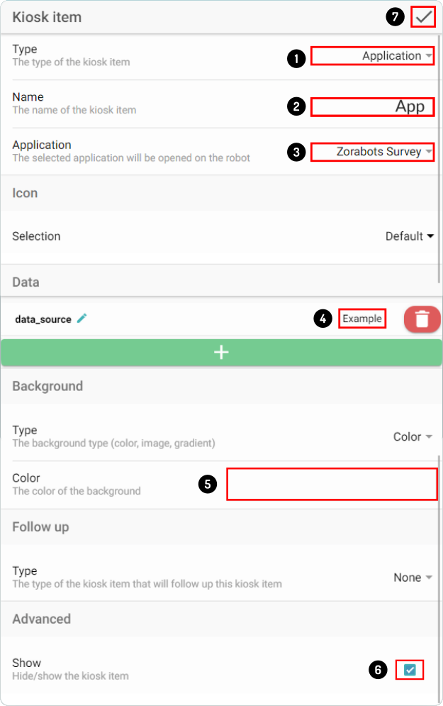
Add the App to the dataset
To demonstrate how an application can be linked in the kiosk, ZBOS Survey will be used in this example. Note however, that if the survey-dataset isn’t stored on the device, the selection-screen in the Survey app (with all available datasets) will be shown instead.
Tap the icon to add a new item to the kiosk. Enter the following settings to create the Demo-composition.
-
Set the type of action for the item to Application
-
Enter the display-name for the item (App)
-
Select the application ZBOS Survey from the list of apps available on the device
-
Enter the name of the Survey dataset for the data_source variable.
-
Remember to set the background-color correct again (will be changed to the last known color by default).
-
Check to if the option show has been selected
-
Tap the
icon to apply the changes.
| This list will only be updated once the kiosk-editor is opened. If the app is installed while the kiosk-editor-page is shown in ZBOS Control, the app will not be shown in the list. Navigate to another page before re-opening the kiosk editor to display the recently installed app. |
Adding the styling to the main Kiosk
| The styling can be added at any point, this is just a personal preference when editing a kiosk. |
Once the content for the main kiosk has been created, the styling for the kiosk can be applied.
| Only the background can be set for individual icons in the list, the other settings will be applied for all items in the kiosk (e.g. background and title-color). |
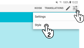
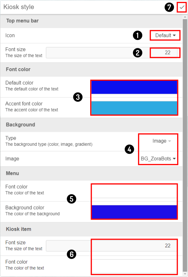
Open the style-settings for the dataset and enter the styling for the situation.
-
Set the custom logo off (Default)
-
Set the font-size for the text in the menu-bar
-
Set the color-scheme for the menu/microphone
-
Set the type of background for the kiosk to Image and set the image from the stored images
-
Set the size and color-scheme used by the top bar
-
Set the size and font-color used by the icons in the kiosk
-
Tap the
icon to apply the changes.
| If a custom logo is selected, no title(s) for menu(s) will be shown. |
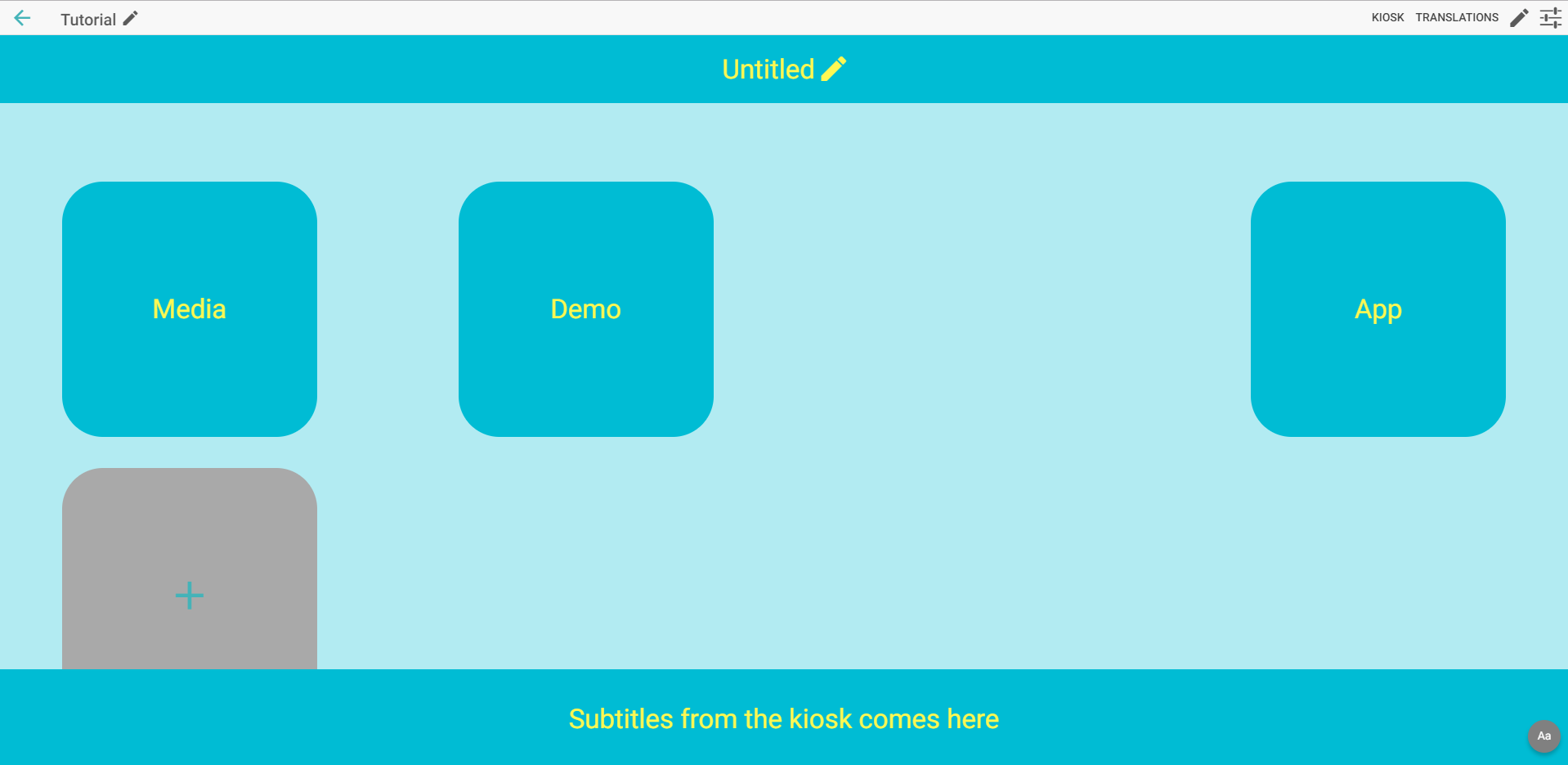
The end-result of the styling is shown in the kiosk editor.
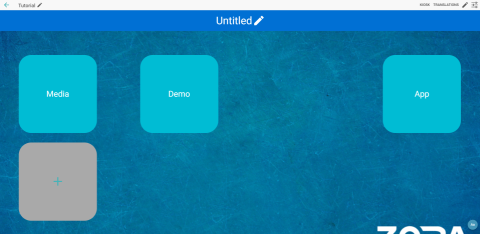
| A lot of images are available on the website https://www.pixabay.com (free license) and icons can be found using the website https://www.iconfinder.com (using the settings: Price:Free and License Type:No link back ). |
Uploading the kiosk to the device
| It is recommended to save the kiosk locally first before uploading the kiosk. |
Once the kiosk has been completed in the editor, all that is left is to upload the kiosk to the device.
Since this is a newly uploaded kiosk, a popup is shown asking to change to the uploaded kiosk-dataset.
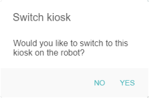
Tap Yes to change the dataset on the device and verify the result.
Fine-tuning the kiosk
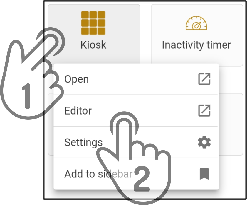
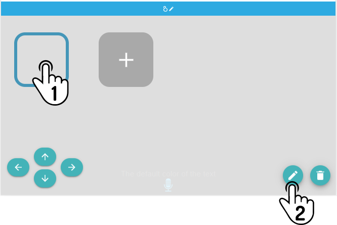
In some (rare) cases, the background-image of the kiosk or the used icon don’t quite fit in the kiosk-theme. To change the settings for the icon, tap the selected icon and tap the icon to open the settings for the icon again.
| When uploading the kiosk this time, no popup will be shown. Instead, the content of the kiosk will be updated once the dataset has been fully uploaded. |